Financial Services Project Summary:
Website Usability Testing with Consumers & B2B Users for BankFinancial
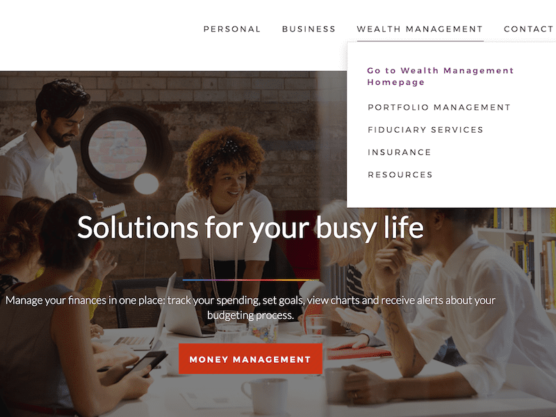
A Chicago regional bank’s marketing team was preparing to launch a new version of its public-facing website for consumers and businesses. They partnered with Marketade to lead pre-launch usability testing on their staging site followed by a 1-day workshop.

Goals
BankFinancial is a publicly-traded regional bank with 19 locations in the Chicago area. The bank’s marketing team was preparing to launch a new version of its public-facing website for consumers and businesses. They partnered with Marketade to lead pre-launch usability testing on their staging site. The project’s goals and specifications included:
- Test with a variety of users across personal and business audiences
- Observe users on desktops, phones, and tablets
- Identify any show-stoppers, low-hanging problems, and long-term challenges
- Generate short-term fixes and long-term solutions
- Conduct a lightweight study as quickly as possible


Approach
Based on BankFinancial’s goals, we conducted qualitative usability testing as the primary research method: 1-on-1 moderated sessions with 10 participants. We supplemented this with quantitative usability testing: unmoderated sessions with 125 participants.
We broke down the project into 5 phases, each lasting about a week.
1. Planning
- We led a 1-hour kickoff call to discuss goals, roles, KPIs, and timeline.
- We designed the research and wrote a 7-page test plan, including usability test interview questions and tasks.
- We created a recruitment plan including email messaging, online screener questions, and phone screener questions.
2. Recruiting
- We sourced candidates from a variety of places. Candidates answered online screening questions to see how well they matched our recruitment criteria.
- We analyzed responses, narrowed the pool, and then conducted phone screen interviews to identify the best candidates.
- Participants scheduled their sessions through our web-based calendar tool and received automated confirmation and reminder emails.
3. Research
- For qualitative research, we moderated 4 usability sessions with users on desktops and 6 sessions with users on phones or tablets.
- We also conducted quantitative usability testing with 100 consumers and 25 business users, on both desktop and mobile.
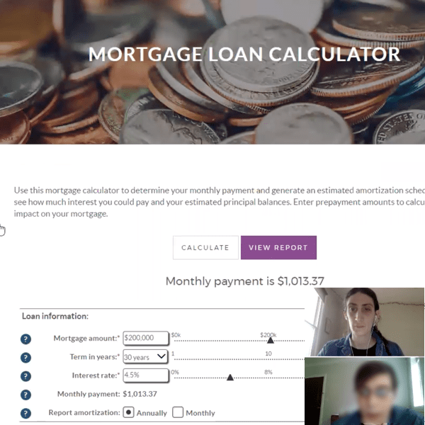


A usability testing participant thinks aloud while interacting with a mortgage calculator on the new website.
4. Workshop
- We led a 1-day workshop at BankFinancial’s offices in Chicago.
- Stakeholders spent the morning observing nearly-full recordings of the most useful 5 sessions from qualitative testing — and taking structured notes throughout.
- After lunch, stakeholders went through a series of steps to analyze, synthesize and align on top UX problems.
- We ended the day by breaking into 3 small groups. Each group brainstormed and sketched solutions for 1 of the top problems — and presented their ideas to the larger group. We closed by aligning on next steps.


Workshop participants organize their research findings during an affinity mapping exercise.
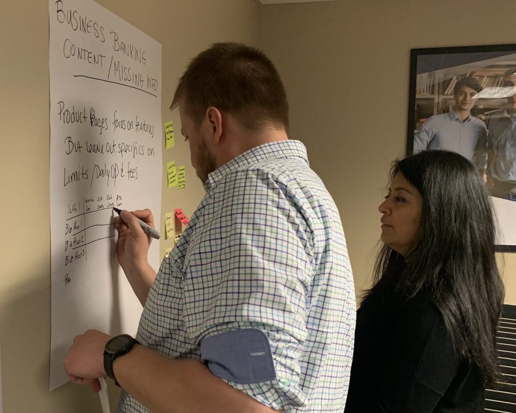


A breakout group collaborates to create a solution poster tackling one of the top problems identified during affinity mapping. To stay grounded in the user research, the group refers back to finding sticky notes (to the right of their poster) relating to their problem.
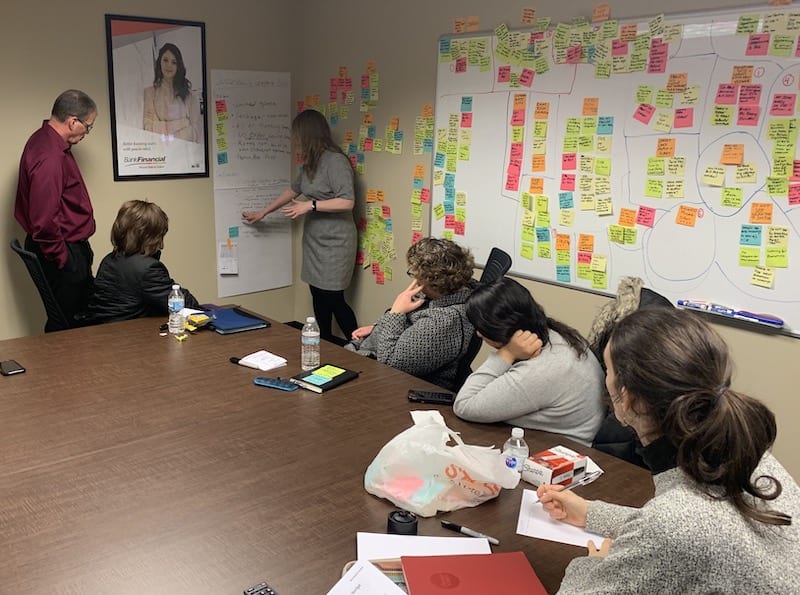


Near the end of the workshop, breakout groups present their solution posters to the rest of the workshop team and reach alignment on which ideas to explore further.
5. Report
- After the workshop, we sent a 13-page summary report.
- It captured the team’s high-priority and low-priority findings from the workshop, along with their solutions ideas.
- It summarized the action items and owners identified at the end of the workshop.
- It also included details on research participants and links to all session recordings.
Impact & Feedback
Our workshop-based approach to this project enabled a diverse stakeholder team to reach alignment on critical website problems and potential solutions in 1 day.
After the project, we received the following feedback from BankFinancial team members:
“Got an objective perspective from actual users” (SVP, Corporate Marketing)
“We found out what customers are looking for in a bank website … and gained insight on what needs to be improved.” (VP, Customer Service)
“[Now we have] a roadmap for big and small wins moving forward …” (SVP, Systems Infrastructure)
About the Project
- Industry: Financial services
- Platform: Public website (desktop and mobile)
- Audiences: Consumers and businesses
- Methods: Qualitative and quantitative usability testing
- Length: 5 weeks
- Primary stakeholder: Marketing team
- Company size: 225 employees
- Company location: Burr Ridge, Illinois (Chicago area)
More Case Studies
Moderated Usability Testing Unlocks Problems in a Bank Account Onboarding Flow
A bank’s design team had redesigned its savings account onboarding flow. Through qualitative and quantitative prototype testing, we identified the top UX friction points and generated 40 improvement ideas.
Helping GEICO’s Mobile App Team Create 5 Roadmaps in 10 Days
In 10 days, 5 GEICO teams built long-term starting visions and short-term roadmaps for their product areas. Along the way, they learned the power of collaborative, structured brainstorming grounded in early user research.