Education UX Research Case Study:
Usability Testing with Preschool Parents for The Goddard School
This top player in early childhood education wanted to improve the web user experience for prospective parents. We ran moderated UX testing with 10 parents and led a 1-day ideation workshop with marketing and design stakeholders.

Goals
The Goddard School is one of the top childcare franchises in the U.S. With over 600 preschools in 37 states, Goddard serves over 75,000 students, from infants to kindergarteners.
A central part of Goddard’s customer acquisition is a website section where prospective families learn more about the school and can sign up for a tour. Most parents land on this part of the site after they submit an initial inquiry for more information which is followed by a Goddard email with a web link.
Goddard’s marketing and design teams wanted to understand and improve the user experience of this part of the site. They partnered with Marketade to conduct a usability testing study.
The team’s research questions included:
- What are the needs of prospective parents at this stage of their journey?
- What are the users’ expectations when they arrive on this part of the website?
- What are their impressions, motivations, and overall experience going from email to the website?
- How easy is it for users to schedule a tour?
- What are the improvement opportunities with the email and website?
- What are other opportunities for motivating users to visit a Goddard location?
Approach
Over a 1-week period, Marketade conducted moderated UX test sessions with 10 parents who matched the Goddard primary user profile. In these one-on-one sessions, we watched users follow the scenario of getting an email from Goddard in response to an inquiry for more information and clicking the link to the website. We then talked with the users about the overall experience and how the experience matched their expectations.
After the research was complete, we led a 1-day workshop with the Goddard team. In the morning, the team took notes as they observed extended clips of all 10 research sessions. In the afternoon, we led an ideation session to identify the findings, prioritize the issues, and generate solutions and an action plan.
The afternoon process included the following steps:
- Participants posted their observations/notes, each written on a sticky note, on the board and then worked to categorize the insights into logical groups.
- Each participant voted on what they felt was the most critical category to address in solutions brainstorming.
- The team discussed the groups, and evaluated any that could and should be combined. The top 4 categories were identified.
- 4 working groups were formed and each group took one of the priority categories and defined the problem, supporting the problem with actual observations, listed solutions and identified action items.
- Each group presented their findings to the whole group, and then engaged in a brief discussion.
- The group discussed specific action items and next steps.
A week after the workshop, we delivered a 16-page report summarizing the research and the ideation session.


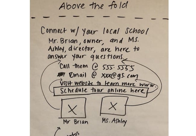
A solution sketch from a workshop breakout team.
Outputs
At the end of the project, the Goddard team walked away with:
- At-a-glance summaries of the 10 research sessions, including user details, relevant context, and key takeaways.
- 34 total research insights.
- 10 top UX problems (out of the 34 total insights) in priority order based on group voting; these problems covered a wide range of areas including video length and categorization, site navigation, email copy.
- Solution ideas for 4 categories of problems.
- 12 next steps (with owners) to tackle/explore the most viable solution ideas.
“Our team found the session very enlightening and beneficial. We got some great takeaways. You guys rocked it.”
More Case Studies
Prototype UX Testing with Kids & Parents for PBS
PBS was exploring a new user experience flow for its digital products used by young children. We led qualitative user research with 12 pairs of parents and children and facilitated a collaborative analysis workshop.
How a Website Survey Gave UVA Health Actionable UX Insights
How do you launch a website survey that captures actionable data without annoying users? Here’s the step-by-step process we used for a regional health system along with the keys to our survey’s success.