UX Research Case Study:
Improving Satcher’s Health Equity Tracker with UX Research
A year after launching its Health Equity Tracker, the Satcher Health Leadership Institute at Morehouse School of Medicine needed to prioritize initiatives based on user research. Marketade led 13 in-depth interviews that helped the team identify UX problems and opportunities based on 4 new personas.
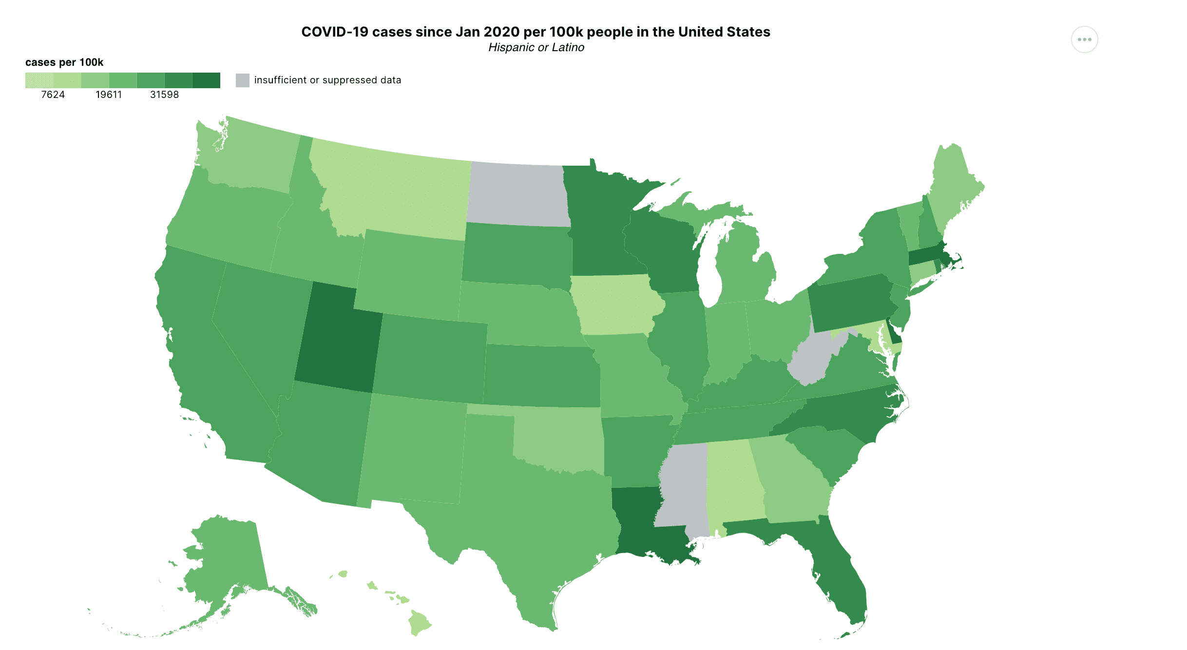
Image source: Health Equity Tracker
Goals
In May 2021, the Satcher Health Leadership Institute at Morehouse School of Medicine launched the Health Equity Tracker, with support from Gilead Sciences, Google.org, the Annie E. Casey Foundation, and the CDC Foundation.
The tracker is a data visualization solution for policymakers, community leaders, and advocacy groups working to advance health equity.
While the product initially benefited from a large team of Google.org engineers, a smaller team maintains the current site. This reduction in resources made it difficult to pursue many of the working group’s initial goals and made prioritization of future initiatives a critical need.
Satcher faced a related challenge: they lacked user feedback channels and lacked a deep understanding of the target audience, how the product is being used, which content and features are most useful, and which pain points are most significant.
In the summer of 2022, Satcher sought a consultant to lead user research and facilitate a process to prioritize future work based on user insights. Their related goals included:
- Learn more about Satcher users and potential users.
- Uncover any major usability issues.
- Use this project as a model to conduct user research in the future.
Satcher selected Marketade to lead the project.
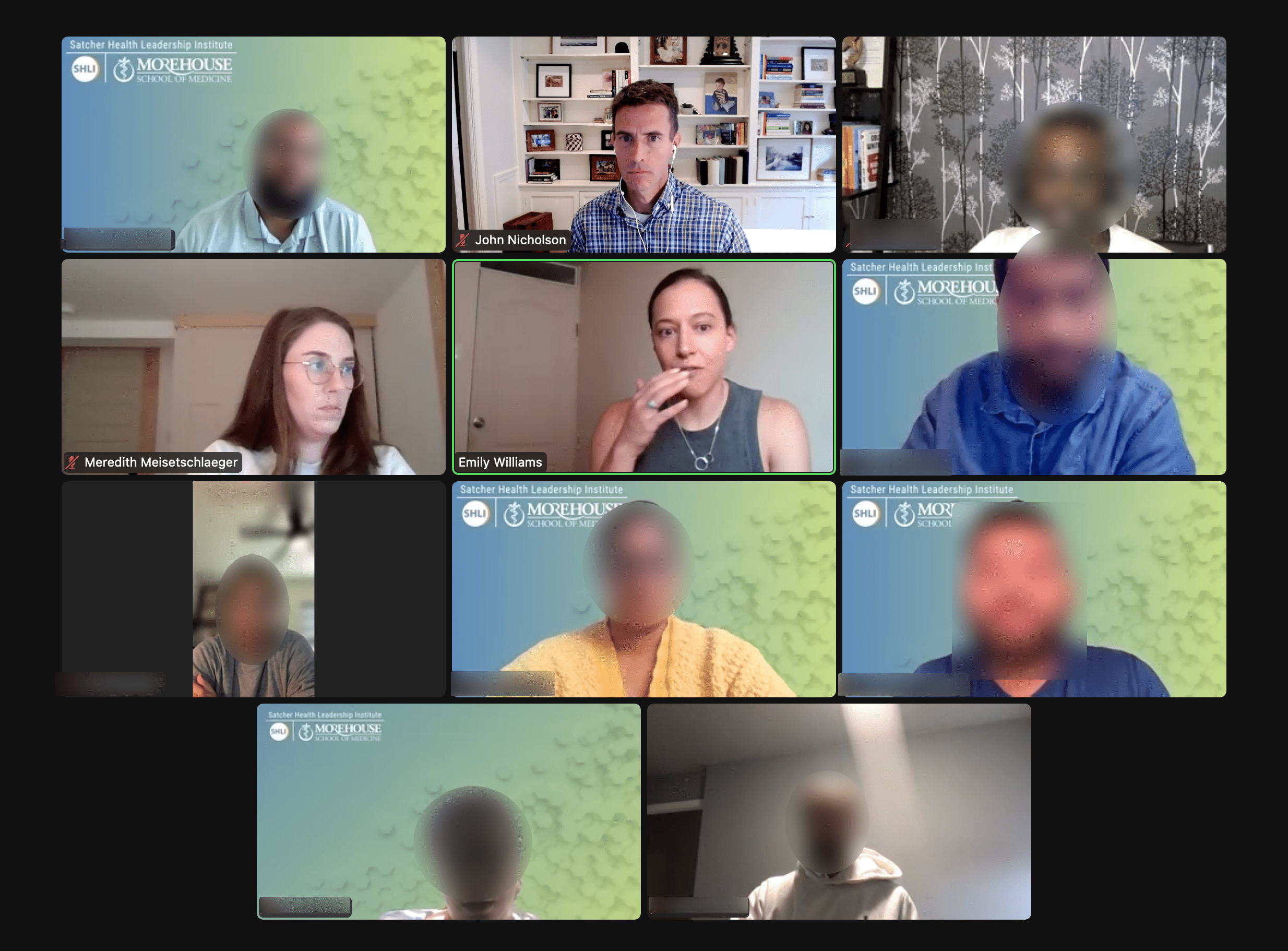


Marketade and Satcher Health team members meet to discuss goals, research questions, and target audiences for the study.
Project Overview
Satcher Health and Marketade kicked off our project in August of 2022. This was the first formal UX research endeavor conducted by Satcher for the tracker to date.
The study took place over the course of 3 months and consisted of 13 in-depth interviews with journalists, policymakers, policy influencers, and researchers — with a mix of use cases for health equity.
After we conducted the research, Satcher and Marketade held a workshop to review and process the results. Marketade facilitated a series of exercises to determine overall usability issues and create personas.
Based on our analysis of the research as well as Satcher input gathered during the workshop, Marketade arrived at 9 final UX priorities for the Satcher team. We also delivered 4 user personas.
Below we share more about the process that we used to arrive at these outputs.
Qualitative User Research
To start the project, we facilitated a kickoff meeting to reach alignment on study goals, research questions, and target audiences. We followed this with a series of 1:1 stakeholder interviews with leaders at Satcher Health. Based on what we learned, we wrote a research plan that included an interview guide.
Recruiting
We conducted recruitment via UserInterviews, a user research participant platform, and via LinkedIn.
UserInterviews panel members applied to the study by completing a short in-platform screening survey. Researchers then contacted respondents who passed the initial screen for a phone screen to ensure that they qualified.
Researchers identified potential participants from LinkedIn through responses to posts and keyword searches. Researchers sent a targeted connection request message to candidates found through keyword searches. Researchers included a link to a screening survey in the outreach message.
From the pool of candidates who passed both screenings, researchers selected final participants based on a range of characteristics with the goal of ensuring an unbiased and representative sample.
Interviews
Researchers conducted each interview in a similar manner. The first half of the interview focused on the user’s background, tasks, and experience with health equity data and related data. The second half focused on the tracker platform itself, with users asked to complete various tasks and asked to think out loud as they completed them.
This allowed us to understand their mental model for using data in their work, as well as determine how the Tracker aligns with or departs from that model. Additionally, by having users complete specific tasks, we could identify any usability issues.
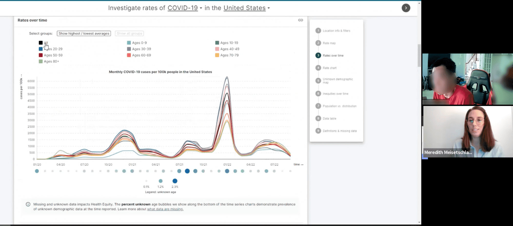


Our researcher (bottom) interviews a research participant (top) as he interacts with the Health Equity Tracker.
Workshop & Outputs
After the interviews, the Satcher team watched recordings and took guided notes. These structured notes served two purposes. First, they served as a guide while workshop participants presented key findings from the recordings they watched. Second, taken altogether, the notes provided a foundation for determining UX issues and developing personas.
UX Problems
To begin the collaborative analysis, participants reviewed the notes they made while watching their assigned user interviews and then sorted their observations into four categories:
- Jobs To Be Done
- Challenges
- Usability/Design Issues
- Other Observations
After presenting their findings to the group, usability-related notes were collected on a central board. Participants used affinity mapping. Affinity mapping is a user experience data analysis method for organizing related findings into distinct clusters which are called themes.
Affinity mapping is critical to organizing qualitative data and identifying patterns within the data. During the workshop, we sorted the usability notes into groups based on common characteristics. We named each group and called that a theme.
Once the themes were organized, we completed a quick prioritization exercise. Each participant was allotted 3 stickers or votes to place by the themes they felt should be addressed first. We started with the themes that received the most votes to develop solutions.
This activity yielded a list of 15 UX problems to resolve, which we grouped into 6 buckets (prioritized from most to least urgent):
- 4 Topic Selection Issues
- 2 Scannability Issues
- 2 Tracker Findability and Brand Identity Issues
- 2 User Interface Issues
- 3 Data Visualization Issues
- 2 Data Detail Issues
Finally, participants brainstormed potential solutions to the two most urgent UX issues. They generated 4 solutions to Topic Selection Issues and 5 solutions to Scannability Issues.
Personas
Between the 1st and 2nd days of the workshop, Marketade researchers analyzed user interview data and workshop participant observations to craft evidence-based Health Equity Tracker personas.
Personas are fictional representations and generalizations of target users who exhibit similar attitudes, goals, and behaviors in relation to a product.
Personas help:
- Understand who interacts with a product
- Understand different groups of users and their use cases
- See differences in use cases among users
- Prioritize design decisions based on user needs
To create the Health Equity Tracker personas, Marketade researchers used affinity mapping to identify patterns among users’ goals, behaviors, and needs. This analysis led to the creation of 4 distinct personas.
For each persona, we shared the following components:
- Overview
- Jobs to be Done
- Barriers Faced
- Context
After reviewing and refining the Health Equity Tracker personas, the Satcher team collaborated to identify persona-specific problems and opportunities based on direct evidence from user interviews.
For each of the 4 personas, they shared:
- The primary problem
- Quick wins
- Long-term solutions
We encouraged Satcher to repeat these exercises with other persona-specific problems as part of continuous UX improvement efforts.
More Case Studies
Usability Testing with IT Security Managers for Malwarebytes
Before starting a redesign of its B2B software product, a cybersecurity company wanted a deeper understanding of its users and their pain points.
Brainstorming GEICO Content Improvements with Remote Research Workshops
A B2B product team wanted to increase its KPIs through better digital content. Marketade conducted 1:1 customer interviews and led 2 workshops to analyze the research and ideate practical content ideas.