Healthcare Case Study:
Increasing Minority Participation in Health Studies: A UX Research Study for NIH
Marketade led user research for a large-scale project to understand the attitudes and motivations among Black and Latinx populations for joining a health study. We conducted multiple rounds of qualitative UX testing on prototypes, with iterative design improvements throughout, plus quantitative UX testing with 700 users.

The Problem
Black and Latino adults are underrepresented in many health studies and medical trials, including for diseases that disproportionately affect minority communities.
This longstanding problem gained mainstream media attention in 2020 during the Covid-19 pandemic. As of late August 2020, Moderna was leading Pfizer in the race to develop a vaccine. Then the company received a call from the head of the Trump administration’s vaccine effort saying that Moderna faced a delay of up to 3 weeks. The reason? As the New York Times reported, “Moderna had not recruited enough minority candidates into its vaccine trials.”
It was at this time that Marketade joined a multi-organization effort to investigate ways to increase Black and Latinx participation in health studies and registries. This study was funded by a grant from the National Institutes of Health National Institute on Aging.
Study Goals
Marketade led qualitative and quantitative user research for the study. We collaborated throughout the project with the strategic design agency Provoc along with a health research institute, a market research agency, and academic partners. The primary goals were:
- Goal #1: Identify barriers and facilitators for recruitment of healthy underrepresented populations for study recruitment registries, with a particular focus on mobile devices.
- Goal #2: Build, test, iteratively improve, and finalize a prototype of a mobile-responsive recruitment registry using design standards and tools to increase enrollment among healthy volunteers and members of underrepresented communities.
To help achieve Goal #1, Marketade led qualitative mobile usability testing to identify online barriers to study recruitment and opportunities to increase motivation and ease of joining.
To help achieve Goal #2, Marketade:
- Provided input to designers as they built two interactive prototypes of a mobile recruitment registry website – one control and one variation prototype that integrated best practices identified, in part, by qualitative research.
- Conducted qualitative usability testing to iteratively improve the variation prototype and then finalize the variation prototype based on 4 rounds of small-scale, qualitative usability testing.
- Conducted quantitative usability testing of the final control and final variation prototypes with 600 participants to examine differences between race/ethnicity groups.
In addition to focusing on Black and Latinx populations, we closely considered the experience of lower-literacy individuals, a sizable part of the U.S. population that is often ignored by product and experience designers.


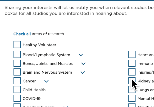
A health registry signup flow that we tested with users during our initial qualitative research.
Mixed-Methods Iterative Research
Below are the 4 phases of the study that Marketade led.
Phase 1: Current State Research
We conducted a qualitative usability study with 40 participants, equally divided between African American and Latinx participants ages 45-75, to learn about facilitators and barriers that individuals experience when signing up for four different health registries. Two of our researchers analyzed the interviews, first independently and then collaboratively. Based on our analysis, we provided a series of recommendations for developing the prototype.
Phase 2: Custom UX Recommendations
We developed recommendations to guide the development of recruitment registries to meet the needs of underrepresented populations better. Our recommendations fell into 5 categories. Here are 2 examples:
1. Building trust and motivation, including:
- being transparent about who is collecting the data and for what purpose
- anticipating and allaying possible concerns about study participation
- differentiating joining a registry and joining a study
- emphasizing the value of the registry in advancing medical progress
- using images that reflect the target volunteer base but do not disproportionately show underrepresented populations
- listing prestigious non-government partners and sponsors
2. Creating content for low-literacy users, including:
- making most important points right away
- keeping copy as brief as possible
- using shorter sentences and paragraphs and bullet points where possible
- using plain language and avoiding technical and unfamiliar terms
- phrasing questions as simply as possible and breaking down complex choices to one choice at a time
- using descriptive button text to help users have clear expectations
- using page titles and section headings to help users understand what comes next
Phase 3: Iterative Prototype Testing
We conducted 4 rounds of usability testing with the control and variation prototype. After each round of usability testing, we updated the variation prototype to incorporate feedback from the testing. Usability testing sessions were conducted with participants ages 45-75 and included African American and Latinx participants. In each round, some participants were considered low literacy.
Across the testing, we learned some of the biggest opportunities to overcome UX barriers were:
- Building credibility
- Targeting the right audience
- Ensuring an understanding of the purpose of the registry and its need to enroll healthy volunteers
Phase 4: Quantitative Usability Testing of the Final Control and Variation Prototypes
In the final stage of the project, we conducted quantitative usability testing with 700+ adults (~1/3 white, 1/3 African American, 1/3 Latinx, including about 100 low literacy individuals) ages 45-75.
This research allowed us to better assess how measures of usability and trustworthiness differed between participant groups on control and variant mobile registry prototypes.
More Case Studies
How Banner Health Reached Consensus on Design Decisions with Recurring Research
A team at this 50,000-employee organization was struggling to align on design directions and digital priorities. A program of recurring, collaborative research created a shared understanding of users and their pain points — and helped the team get on the same page.
Improving Satcher’s Health Equity Tracker with UX Research
A year after launching its Health Equity Tracker, the Satcher Health Leadership Institute at Morehouse School of Medicine needed to prioritize initiatives based on user research. Marketade led 13 in-depth interviews that helped the team identify UX problems and opportunities based on 4 new personas.