Financial Services UX Research Case Study:
Rapid Testing & Overnight Iteration Yield Quick Fixes for a Top Bank
A top-5 American bank was about to roll out a new self-service loan application and wanted to fix any low-hanging problems pre-launch. We scheduled 10 users for UX testing over 2 consecutive days. On the evening of day 1, a designer implemented quick fixes to the prototype, which we tested with new users the following day. In just 2 days, we were able to identify quick wins for pre-launch plus larger opportunities for post-launch.

Project Overview
- A division of a top-5 American bank was launching a new self-service loan application. Epsilon, a global ad agency and marketing technology leader, was leading the project’s UX and visual design.
- Epsilon and its client wanted to test a prototype of the new flow with users and make improvements to the experience prior to launch.
- On back-to-back days, Marketade led live prototype testing with 5 users each day followed by analysis and ideation workshops.
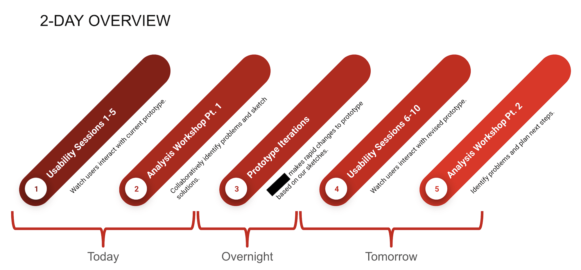
- During the evening after Day 1, designers made rapid changes to the prototype based on the workshop outputs. We tested the revised version on Day 2.
- Small, iterative changes yielded noticeable improvements to the experience on Day 2. After Day 2, the teams agreed upon which of the validated changes to implement; they also identified additional improvements to make.
Goals
Early in the project, Marketade collaborated with Epsilon and its banking client to reach alignment on the research goals for this study. They included:
- Ensure that users are able to successfully navigate the personal loan application process.
- Uncover any usability or comprehension issues across the pages.
- Compare the usability of various options within the loan application.
The design team had mocked up 2 versions of an application for us to test. We worked with them to identify the key elements that differed between the versions.
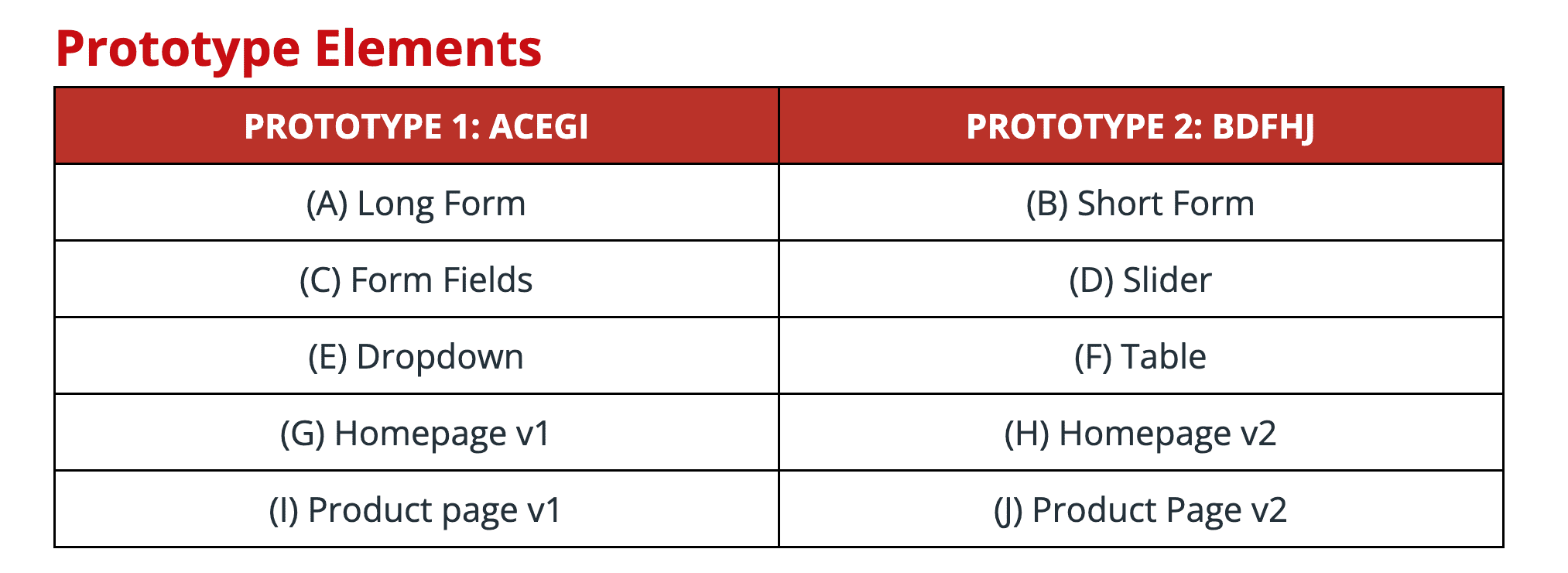


The design team provided us with static page designs. We moved those static mocks into Axure where we created 2 interactive prototypes for testing.
We then wrote a 5-task test script that was flexible enough to work with both versions. For each task, we included 1-3 potential probing questions.
Iterative Testing & Workshops
On back-to-back days, Marketade led live prototype testing followed by analysis and ideation workshops. We tested with 5 participants each day.
Prior to the live testing workshops, we conducted 2 pilot sessions. These sessions allowed us to validate and improve the script prior to live testing. They also served as backup sessions that we could play recordings of in the event of a no-show.
We followed the process shown below during the 2 days of live testing and collaborative analysis.


2 Marketade team members facilitated the research sessions and the workshops, all of which we conducted remoted. 12 Epsilon team members and 13 bank team members observed at least some of the research sessions.
A core group of 6 team members (3 from Epsilon, 3 from the bank) joined Marketade for the full process — observing all research sessions and participating in the analysis and ideation exercises.
We facilitated the following steps for analysis:
- Stakeholders individually took notes while watching usability sessions in response to the focus question: What are the primary barriers to users completing loan applications?
- They then used a virtual whiteboard to group findings by prototype element and by theme.
- Next, they voted on which problems were most likely to have solutions that we could easily prototype and test by the following day.
Once we reached alignment on the problems, we went through the following ideation steps:
- Individually and in small groups, participants brainstormed solutions to the prioritized findings.
- The group came back together to discuss solutions and next steps.
Outcomes
The key findings from this iterative study included:
- Users exhibited a lack of understanding of what would be sent to creditors vs. what would be sent to them.
- Some users were confused about where they were in the process.
- Users were confused by the transition between the pre-approval process and moving to fully apply for loan.
- Users were confused about saving the application and the purpose of the retrieval code.
Small, iterative changes yielded noticeable improvements to the experience on Day 2. In addition, the team was able to identify additional improvements to make after Day 2.
More Case Studies
Improving Satcher’s Health Equity Tracker with UX Research
A year after launching its Health Equity Tracker, the Satcher Health Leadership Institute at Morehouse School of Medicine needed to prioritize initiatives based on user research. Marketade led 13 in-depth interviews that helped the team identify UX problems and opportunities based on 4 new personas.
Brainstorming GEICO Content Improvements with Remote Research Workshops
A B2B product team wanted to increase its KPIs through better digital content. Marketade conducted 1:1 customer interviews and led 2 workshops to analyze the research and ideate practical content ideas.