UX Research Case Study:
Usability Testing with Older Adults for a New AARP Digital Platform
A team at AARP was eager to increase adoption and engagement for a new life management platform. Marketade combined usability testing and a heuristic evaluation to identify UX improvement opportunities.

Background
A division at AARP had recently launched a new high-profile digital platform targeting Americans 50 and older. The platform was, according to the Washington Post, “a multi-faceted approach for aging adults who want to find new purpose and challenges.”
The site was open to everyone, not just AARP’s 37 million members. It offered an innovative, personalized set of life-management tools and programs to help Baby Boomers tackle their new life stage.
Over 1 million people were using the platform within its first year. A team at AARP was eager to increase adoption and engagement.
AARP initially partnered with Marketade to help develop a framework of key performance indicators (KPIs) for the platform. We led a series of workshops with senior team members and reached alignment on a KPI model with business objectives, supporting web metrics, and target metrics by quarter.
Once the KPIs were established, we shifted gears and conducted a rapid round of usability testing on the platform.
Approach
Here’s an overview of the approach we used for the usability testing study:
- We designed a qualitative study that included 1 scenario, 6 tasks, and 4 post-test questions.
- We recruited participants within a target age range who were retired or about to retire.
- We conducted remote usability test sessions with participants.
- We ran a mix of desktop sessions and mobile sessions.
- We asked users to explore the platform, find and sign up for a program that interested them, and complete the first activity in that program.
- We also conducted a heuristic evaluation of the site, assessing it against established UX best practices.


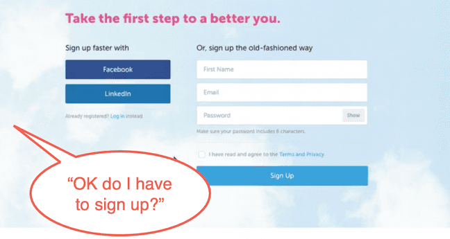
Users were reluctant to sign up for the platform before they had a chance to try some of the tools and programs.
Outcome
We delivered an executive summary report that identified 5 key findings and provided a recommendation for each problem.
- We also provided a detailed list of 24 findings.
- We categorized each finding by its section or page.
- We also linked to research session clips and annotated screenshots that demonstrated the problem.
- For each finding, we provided 1 or 2 solution recommendations.
- Where possible, we supported the recommendation with a design mockup.
- Finally, we used a 5-point scale to assign a priority score to each of the findings.
Here are some examples of higher-priority findings:
- Homepage does not provide a clear understanding of the platform’s purpose.
- Critical navigation options are hidden and not noticed by users.
- Users are reluctant to create an account.
And here are some examples of lower-priority findings:
- The “No thanks” button prior to onboarding is confusing to users.
- Non-interactive icons appear clickable.
- Users want to know if there is a fee to use the platform.
More Case Studies
Prototype UX Testing with Kids & Parents for PBS
PBS was exploring a new user experience flow for its digital products used by young children. We led qualitative user research with 12 pairs of parents and children and facilitated a collaborative analysis workshop.
Helping Mount Sinai Improve Cancer Patient Health Through Usability Testing
With a launch date looming, a team uses rapid UX testing to improve a web-based health app for oral cancer survivors and caregivers.