Real Estate Case Study:
Boosting Real Estate Leads by 180% with User Research & A/B Testing
A real estate company adopts a culture of research and testing, and within months achieves a radical lift in conversions.
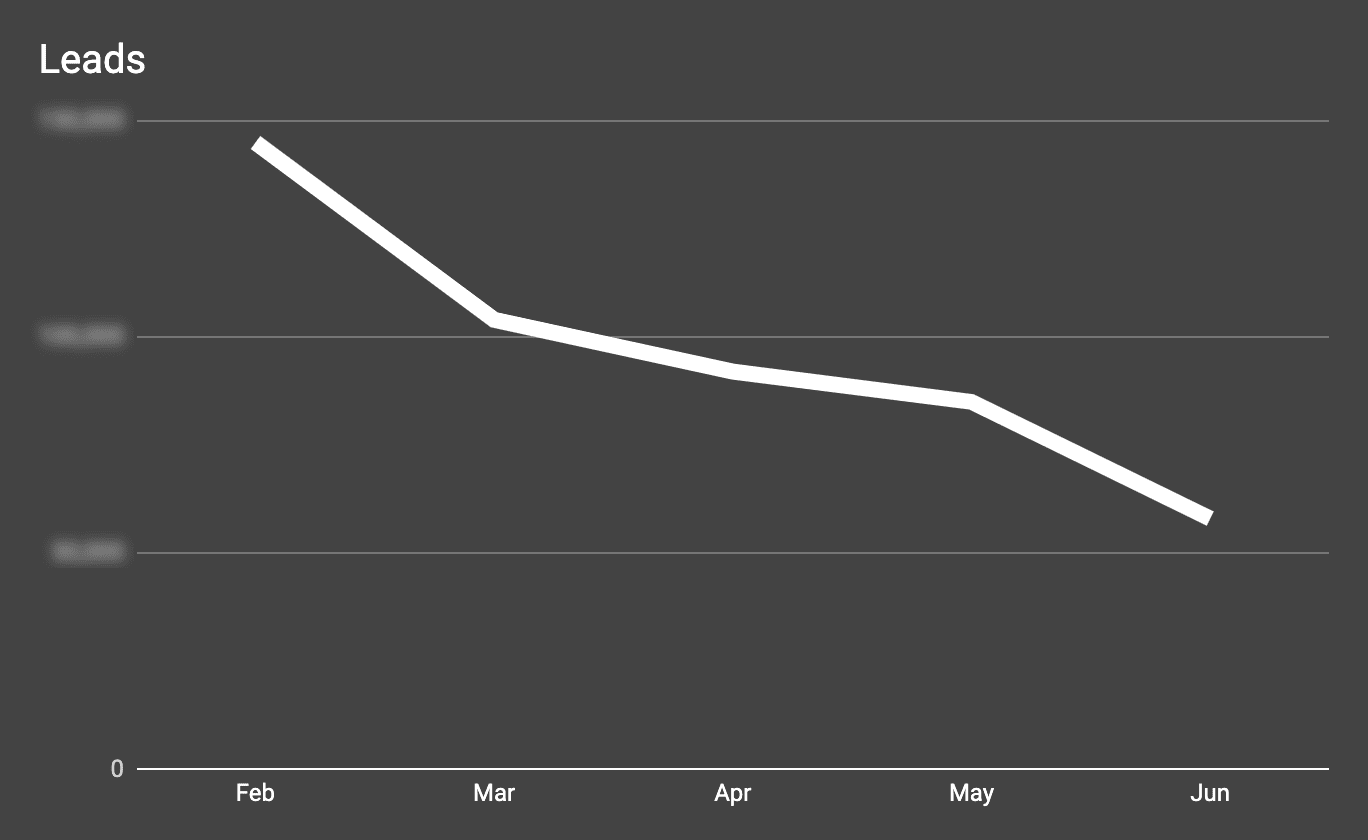
Challenge: Leads Down 60%
The multi-state apartment finder company called us in a panic. A few months earlier, the marketing team had worked with a design agency to overhaul their website: new design, new content, and new property search functionality.
Now their #1 KPI, renter leads, was down 60% over the prior year. They wanted to understand why and to take action to reverse the trend.
Approach, Part 1: Interviews, Personas & Usability Testing
We went to work implementing and operationalizing an iterative, collaborative user research program:
- Qualitative research validated by …
- Web analytics followed by …
- Design and content changes validated by …
- A/B testing
Our first step was to conduct 1:1 interviews with the company’s leasing agents and customer support staff. We quickly gained an understanding of their renter customers: their behaviors, pain points, questions and concerns.
Within weeks we prototyped 2 primary renter personas that we would refine over time as we talked to actual customers. Early on, we saw that new and improved content was a big opportunity with the site, so we had our UX writer, Nora Fiore, lead the customer research and persona creation.
Next we started usability testing the site with people who were in the market for a new apartment. The stakeholder team observing the sessions included the real estate firm’s marketing director and CEO, along with their design and development team.
Over the course of multiple rounds of testing, the team identified over 50 problems with the site and search application. For many of these, we turned to Google Analytics to validate and size the problem.
We collaborated to identify initial solutions for most of these problems. To help prioritize the work, we gave each solution an “Opportunity Score” which combined separate sub-scores for Impact and Effort. We ended up with five “9”s and fifteen “8”s. Of these, we identified a number of solutions worth A/B testing.
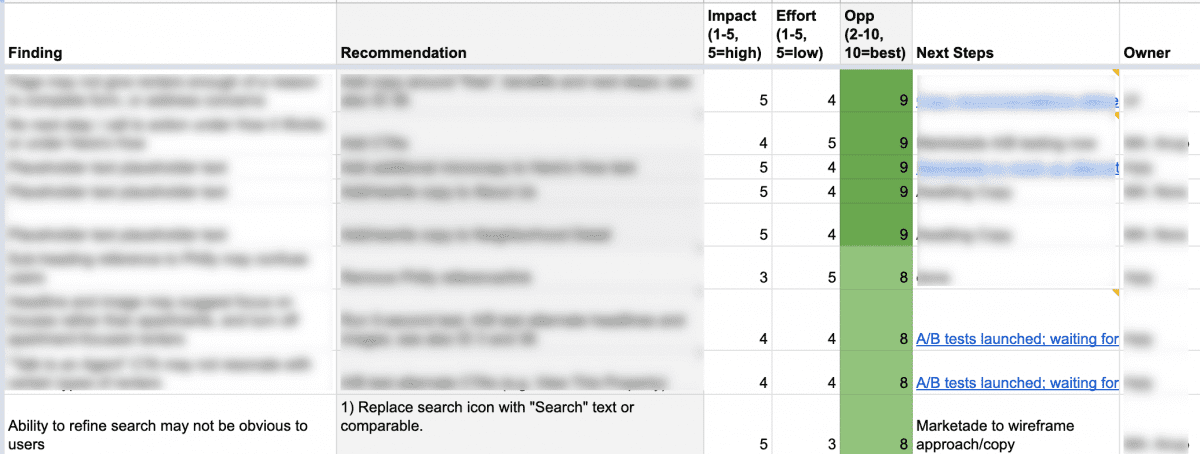


A shared spreadsheet with UX findings and recommendations.
Approach, Part 2: 7 A/B Tests in 8 Weeks
The A/B test ideas included the most ambitious changes, as well as some that we hoped would be quick wins.
Over the years we’ve learned a surefire way to kill energy and momentum around a research-and-testing program: saddle already-busy developers with all the solution implementation work.
So we used Optimizely to implement all of the tests, allowing us to bypass the developers. We launched the tests in waves of 1 to 2 at a time every couple weeks. By the end of 8 weeks, we’d launched 7 tests. 3 of those were purely content changes; the other 4 included content and layout/design changes, including some that affected multiple pages.
We tracked all experiments in a shared spreadsheet that included short names for each design variation, links to screenshots, and a hypothesis for each experiment.
A second thing we’ve learned over the years: even though it’s exciting to launch A/B tests and get quantitative results, you can’t drop the qualitative user research. As you’re launching the experiments, you must circle back to moderated UX testing to observe users interacting with the new designs. Qualitative research might show you why a new design is failing. It might suggest ways that a winning new design could be tweaked to perform that much better. Or it might open your eyes to a completely new solution.
![]()
![]()
![]()
Excerpt from our simple A/B testing tracker.
Result: 180% Lift in Leads
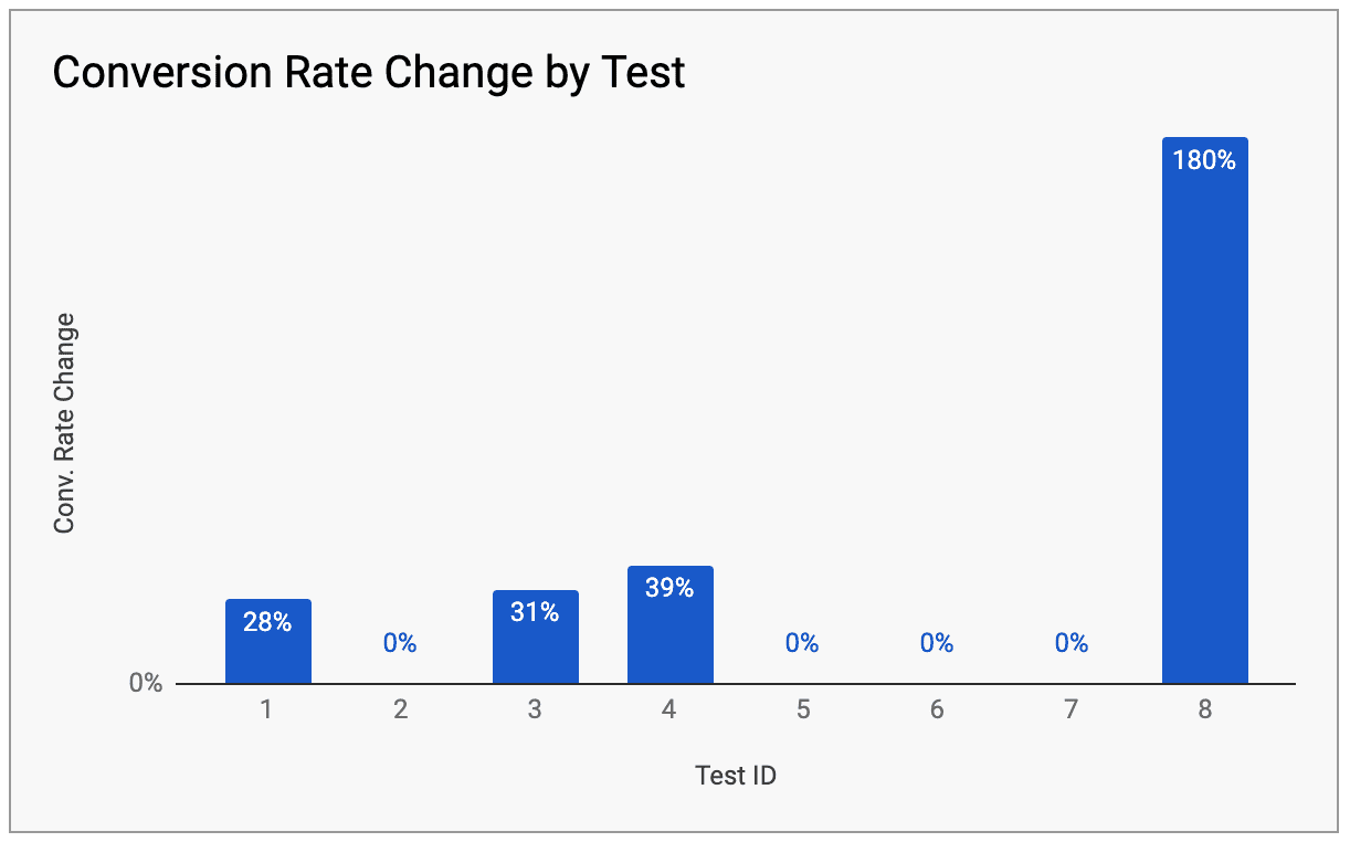
Of those first 7 experiments, 4 saw no significant change one way or the other. The other 3 each achieved renter lead conversion rate increases of over 25%.
The team was encouraged by these results. As the experiments surpassed 90% or 95% confidence levels, we passed the variations onto developers to implement as the new control. But as we looked more closely at the numbers and annualized the increases, we realized we’d still be below last year’s lead numbers.
That’s when the return to qualitative research saved us.
It was in one of the usability testing observation sessions that something struck the marketing director. She said to the team:
“Site visitors understand what we’re offering now. And if they get to our content about the value of working with a leasing agent, they convert into leads. But most never get there. They jump into our property search … and bail after a few searches because our online inventory is light. What if we just removed the apartment search option entirely?”
It seemed like a crazy idea. How could a web-powered apartment finder company not offer the ability to search for apartments?
But as she reminded us of what we’d just watched, the idea started to seem less crazy. Soon the discussion shifted to “How much work to A/B test this?”
It turned out, it took less than a day of work to launch a new, search-less version of the site within Optimizely.
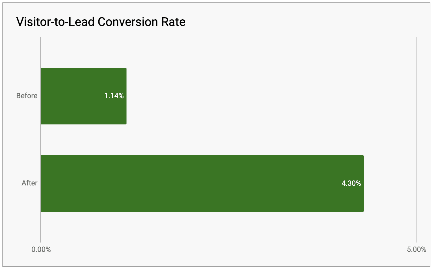


It took less than a week to gain 95% confidence that the new design was a big winner. The percentage of site visitors to convert into renter leads shot up from 1.5% to 4.3% — a 180% improvement. This put the team on track to erase their lost lead volume and beat past performance.
We emailed the results to the team. The CEO responded enthusiastically and publicly thanked his marketing director: “It was a brilliant idea!”


About the Project
- Industry: Real Estate
- Platform: Website
- Audience type: Consumers
- Specific audiences: Apartment renters/seekers
- Methods: User interviews; personas; usability testing; A/B testing
- Stakeholder teams: Marketing, IT
- Organization size: Under 100 employees
- Organization headquarters: Washington DC
More Case Studies
Moderated Usability Testing Unlocks Problems in a Bank Account Onboarding Flow
A bank’s design team had redesigned its savings account onboarding flow. Through qualitative and quantitative prototype testing, we identified the top UX friction points and generated 40 improvement ideas.
Using Research-Based Personas to Boost GEICO Self-Service
A GEICO team was trying to move the needle on self-service for an important transaction. They needed a tool to increase innovation and settle design debates. We interviewed 20 customers and created personas that grounded design decisions in research.