Nonprofit Case Study:
How PetSmart Charities Combined Usability and A/B Testing to Increase a Signup Rate from 27% to 71%
A national nonprofit embraces a research cycle with qualitative and quantitative testing — and achieves a 167% lift on its top KPI.
Challenge: “Not What I Expected”
For the first time in 10 minutes, the bulldog lover in our usability test was speechless.
She’d been browsing the PetSmart Charities website on her phone, learning about the nonprofit and its efforts to end pet homelessness. She was impressed by the stats and moved by the stories of pet lovers adopting dogs and cats.
Then she saw a signup box for an email newsletter and proceeded to enter her email address and tap “Submit”. Up came a new screen. After a long pause, she said:
“This is not what I expected. It’s asking for my address? Why do they need that?”
She went on to complete the form, with various hesitations, questions, and frustrations along the way.



A research participant completes the previous newsletter signup process.
***
This session was part of quarterly user research and testing cycle that we helped PetSmart Charities implement. Each quarter we worked with them to conduct usability testing in parallel with Google Analytics analysis, focusing on 1 application flow or content area at a time.
We then shared and discussed the findings with their website committee — a cross-section of stakeholders from communications, IT and other teams — at the end of the quarter, along with KPI results. Where possible, we’d propose an A/B test for next quarter based on the research, and then report on the results of that in the next meeting.
Unlike many organizations that start a process like this and abandon after a couple rounds, the PetSmart Charities team stuck with it quarter after quarter, no matter how busy they were with redesigns or other projects. The following is just one example of how their discipline paid off.
***
The bulldog lover wasn’t the only participant in that quarter’s usability study to be confused and frustrated by the newsletter signup process. We quickly saw a pattern across the pet lovers in our study. Most frustrated were the users on their phones, who had to work that much harder to answer all of the form’s questions.
We jumped over to Google Analytics. Was our study group representative of the larger population of PetSmart visitors when it came to signing up for the newsletter? Yes, said the quantitative data. 3 out of 4 people who started the newsletter signup process abandoned before completing the flow. And many of these people were also leaving the site at that point.
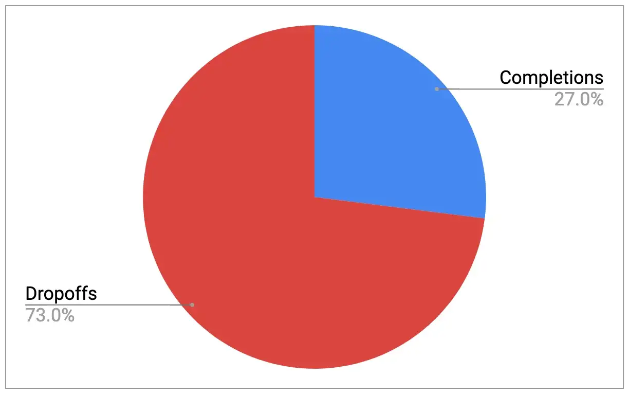


Newsletter signup completion and drop-off rates.
The next stop was the team at PetSmart Charities. “What happens on the backend when someone does this?” we asked, showing them a recording of a usability test participant submitting their email address and then stopping on the “Signup” page without completing the process. “Do they still get added to your newsletter list?”
“Hmmm … we don’t know. We’ll find out”, they responded. And off they went to the fundraising team that manages the email list.
Days later, they had the answer. None of the “signup page abandoners” were getting captured, representing a major lost opportunity for engaging hand-raisers and bringing them back to the site to donate, find adoptable pets, and more.
Approach: A/B Testing of Simplified Form
Usability testing had not only exposed a problem, it also pointed us toward a solution.
By hearing representative users think out loud as they interacted with the site, we had some clear ideas for how to overhaul the form and provide a better newsletter signup experience.
The PetSmart Charities team told us which pieces of information were must-haves. With that, we went to work and proposed a series of changes.
After some back-and-forth with PetSmart and their design agency, Provoc, we arrived at a new Signup page.
Using Google’s A/B testing tool, we then launched an experiment that sent 50% of newsletter hand-raisers to the original page and 50% to the new page.
Result: Completion Increase from 27% to 71%
Over the course of the experiment, the original page (“A”) converted 27% of Signup flow visitors, in line with historical analytics data.
The new page (“B”) converted 71% of visitors — representing a 167% increase in the newsletter signup completion rate, with 100% confidence.
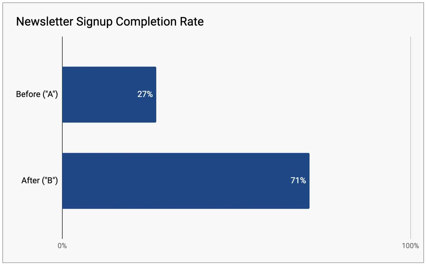


A/B test results based on data from Google Optimize.
Other KPIs went up as well, including adoptable pet searches and interest in adoption events. The new page kept visitors on the site and gave them opportunities to take other actions.
“This is perfect timing!” declared the manager at PetSmart Charities when she first saw the results. As the person who oversaw the website, she was trying to build support for applying this same approach to their online donation forms: usability testing, supported by web analytics, then design changes supported by A/B testing.
Now she had proof that the approach could work.
A week later, we presented the test results in the quarterly web committee meeting, then turned it over to the manager, who made her case for tackling donation forms next.
The buy-in was quick. A few weeks later, we were off and running with a new round of usability testing, spotting problems and opportunities with the donation process.
About the Project
- Industry: Nonprofit
- Platform: Website
- Audience type: Consumers
- Specific audiences: Charitable donors; pet lovers
- Methods: Usability testing; A/B testing
- Qualitative sample size: 12 participants
- Stakeholder teams: Marketing, communications, IT
- Organization size: Under 100 employees
More Case Studies
UX Audit for Search Inside Yourself Leadership Institute
The marketing team at this national nonprofit was eager to increase B2B leads for its enterprise training service. With the help of our UX and content audit recommendations, they saw a 100% increase in leads and a 500% lift in hand-raisers.
How Workshops Helped AARP Get Aligned on a KPI Measurement Model
A business unit at AARP was struggling to reach alignment on key performance indicators for its new web platform. Marketade led a collaborative process to help the AARP team reach alignment on business goals, KPIs, and target metrics.
Boosting Real Estate Leads by 180% with User Research & A/B Testing
A real estate company adopts a culture of research and testing, and within months achieves a radical lift in conversions.