Healthcare UX Research Case Study:
Website Usability Testing with Patients for UVA Health
To improve its website experience for patients, we led mixed-methods usability research for this major regional health system with the #1 hospital in Virginia. After combining qualitative UX testing with 2 types of quantitative research, we led a 1-day analysis workshop.

Background
How much time did you spend the last time you had to find and select a primary care provider? Where did you look? What factors did you consider? What about when you had to find your way to the first appointment with that doctor? How easy was it to locate their office, get directions, and figure out where to park once you got there?
These are questions many people look to their local hospital website to answer. Often it is difficult to find answers due to the way the information is organized and presented.
Recently, a team at UVA Health wanted to improve the user experience for patients and caregivers engaged in these types of core tasks. UVA Health was migrating its large, complex flagship website to a new backend platform and they took that opportunity to assess its usability.
The team was eager to try our collaborative method of research analysis, and they were so pleased with the results that they asked Marketade to come back and do it again with a different team.
Step #1: Qualitative research
We conducted 3 types of research for this project:
- Primary: Usability testing (qualitative)
- Secondary: Website survey (quantitative)
- Secondary: Session replay analysis (quantitative)
To design the qualitative usability research, we collaborated with our main point of contact to come up with a set of scenarios for people to test on the website. We settled on 5 common scenarios including:
- Selecting primary care doctor
- Getting to primary care appointment
- Visiting family member in hospital
- Scheduling and researching a mammogram
- Researching offerings for child food allergies
Those often took some time within our research sessions, but if we had time we also ran through one or more of the following scenarios:
- Getting a second opinion for heart failure
- Finding hip replacement cost and insurance info
- Researching treatment options and offerings for brain tumor
- Researching options for a relative’s failing liver
We conducted the research remotely with 6 people local to our client. It was a smaller town and we wanted to get a diverse, representative group, so we took some time with the recruitment task on this one. We screened candidates until we had just the right demographic mix and mix of desktop/mobile users. Recruiting is often the tricky part, and this project was no exception!
Step #2: Quantitative research
To supplement our qualitative usability testing, we also conducted 2 types of quantitative research: a website survey and session replay analysis. For the website survey, we captured 600 responses from 2 survey variations with 2 quick questions. Learn more about the survey part of this project: How a Website Survey Gave UVA Health Actionable UX Insights.
For the session replays, we captured brief screen capture videos of individual user sessions showing scroll, click, navigation and other behavior. We used software called FullStory to capture 5,000 user sessions on the site. To protect people’s privacy, we masked form fields with PII.
Session replays lack the ability to know what’s in the person’s head or understand their full intent, but we were able to piece together a story with the knowledge gained from other research methods.
Step #3: Analysis as a team
We like to remind clients that, while we can help teams follow usability best practices in a broad sense, our client teams are the experts on their products, users, and constraints. The best way we know how to make a website do its job better is to show our client teams people trying to use the site.
After we completed the research, we traveled to Charlottesville and led a day-long analysis workshop with 9 stakeholders from digital marketing and other teams.
We spent the morning reviewing the research together:
- We watched the qualitative research interviews and took detailed notes on the barriers to completing the tasks that we observed.
- We viewed the results from the survey, which supported what we saw in the qualitative interviews.
- And we watched some sample screen capture videos, which again supported what we saw in the qualitative sessions.
In the afternoon, we took our notes and put them through a collaborative grouping and prioritization exercise on the walls of the conference room. This helped us whittle it down to 3 key opportunities, that can generically be captured as:
- Improve search
- Make content easier to find and understand
- Add content that is missing
Getting to next steps
We spent some time in the afternoon brainstorming solutions and discussing who could take the most valuable next steps, and when.
It is difficult to make major changes to the search functionality of a major website. But after this project, the UVA Health team was armed with solid evidence and they were able to argue for the right next steps to get those balls rolling. In the meantime, we found plenty of low-hanging usability issues to keep the team busy.
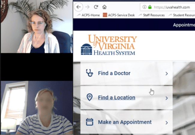


Our researcher (top) moderates a usability testing session with a user (bottom) of the UVA Health website. The participant thinks aloud while trying to complete core tasks on the site.
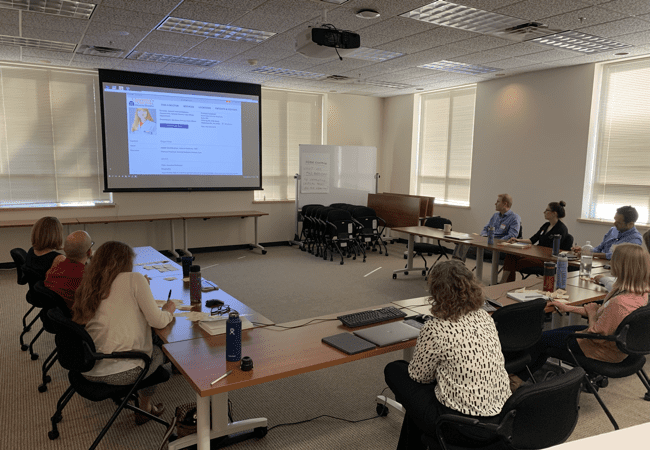


UVA Health team members take notes on post-its as they observe recordings of research sessions. Later, they will post their notes on the walls and participate in collaborative analysis exercises.
“The facilitation was great. Awesome to think about problems this way.”
More Case Studies
Prototype UX Testing with Kids & Parents for PBS
PBS was exploring a new user experience flow for its digital products used by young children. We led qualitative user research with 12 pairs of parents and children and facilitated a collaborative analysis workshop.
How a Website Survey Gave UVA Health Actionable UX Insights
How do you launch a website survey that captures actionable data without annoying users? Here’s the step-by-step process we used for a regional health system along with the keys to our survey’s success.